Seattle, Washington
Supported by the Burke Museum in Seattle, we were assigned to create a mobile app and explore how we could use mobile technology and interactions to create a new visiting experience.
Designed alongside the clever Gaby Chan.
The Burke is a research museum in Seattle, collecting more than 16 million biological, geological, and cultural objects to help people understand Pacific Northwest history.

The New Burke Museum
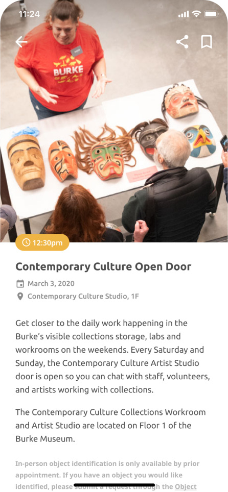
The Burke wants to facilitate inquiry-based conversations between the Burke staff and visitors by launching the volunteer program and conducting Oepn Door sessions to visitors.
Open Door session on weekends
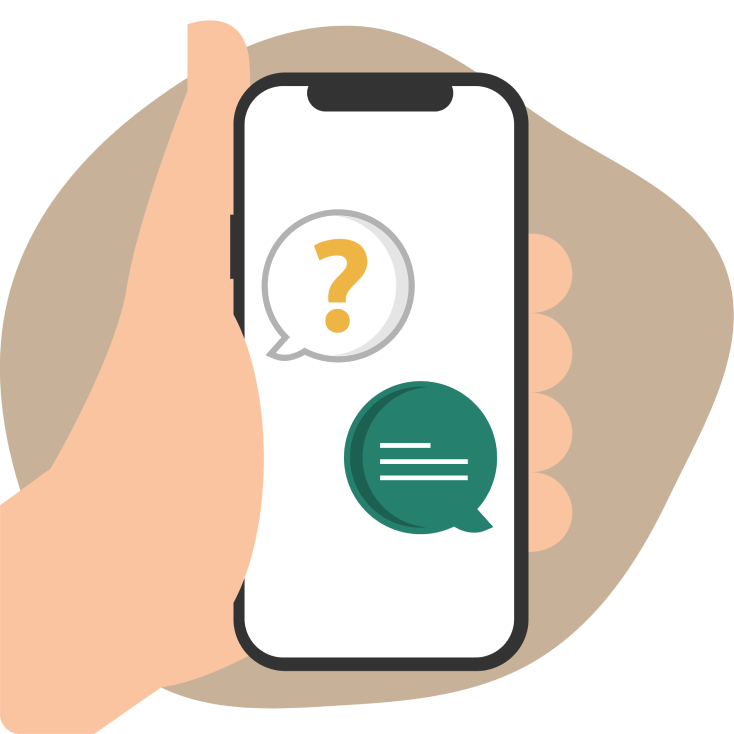
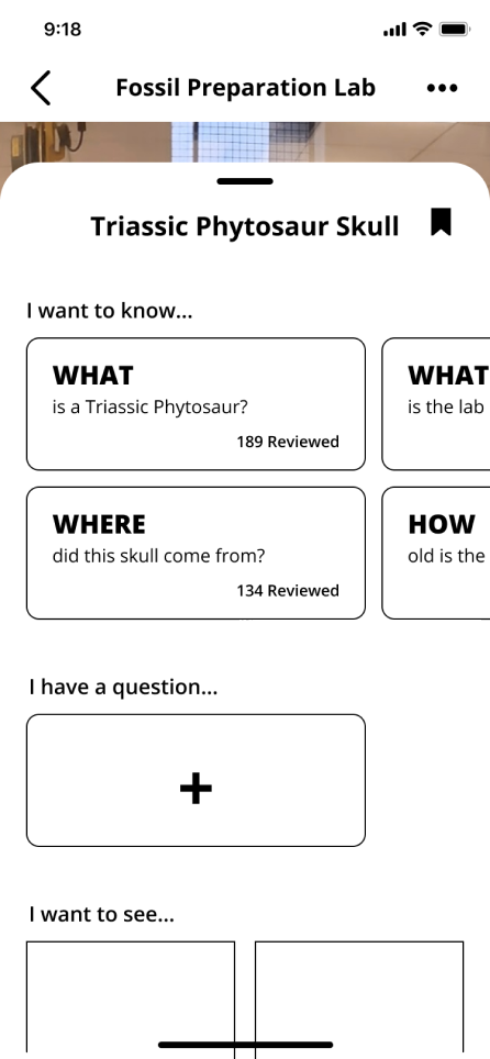
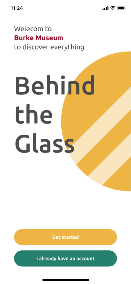
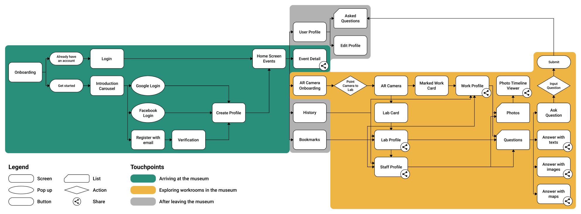
Behind the Glass is an Augmented Reality app that facilitates inquiry-based exploration of the Burke Museum's research labs.
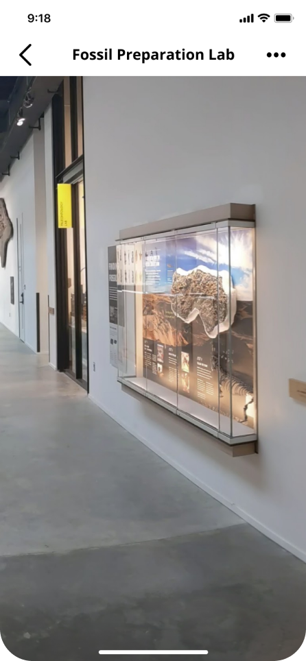
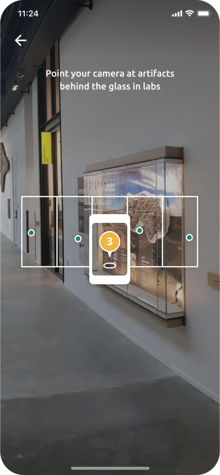
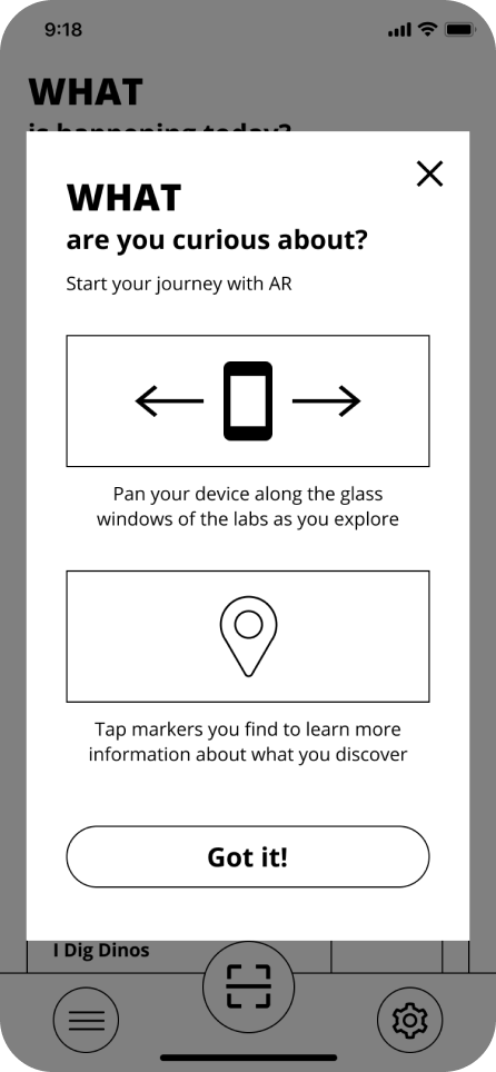
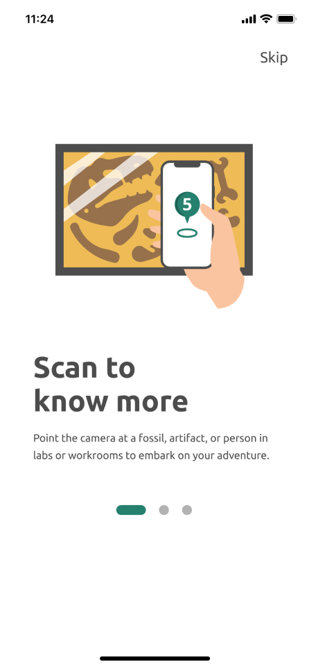
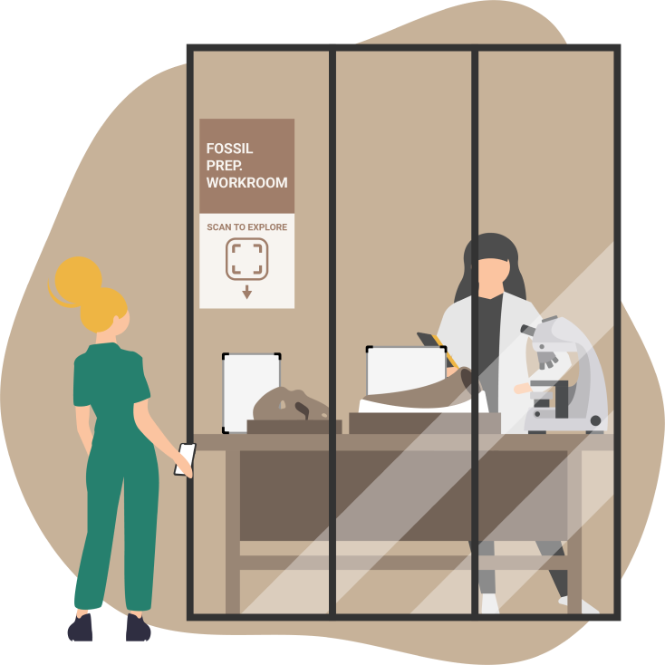
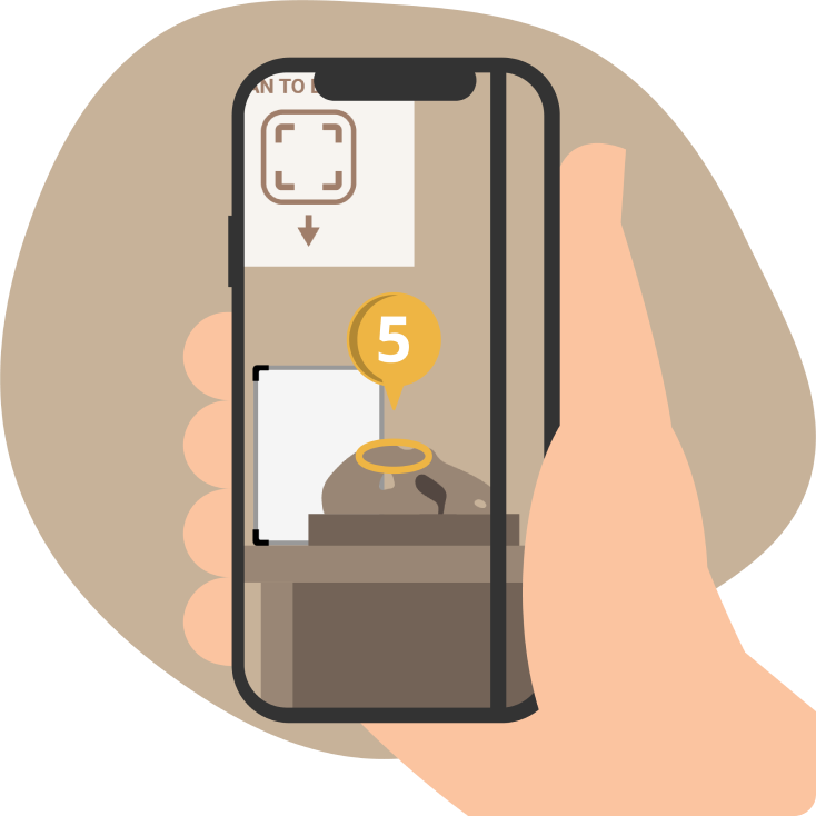
Pan around the labs and workrooms with the phone to discover AR markers on the screen.
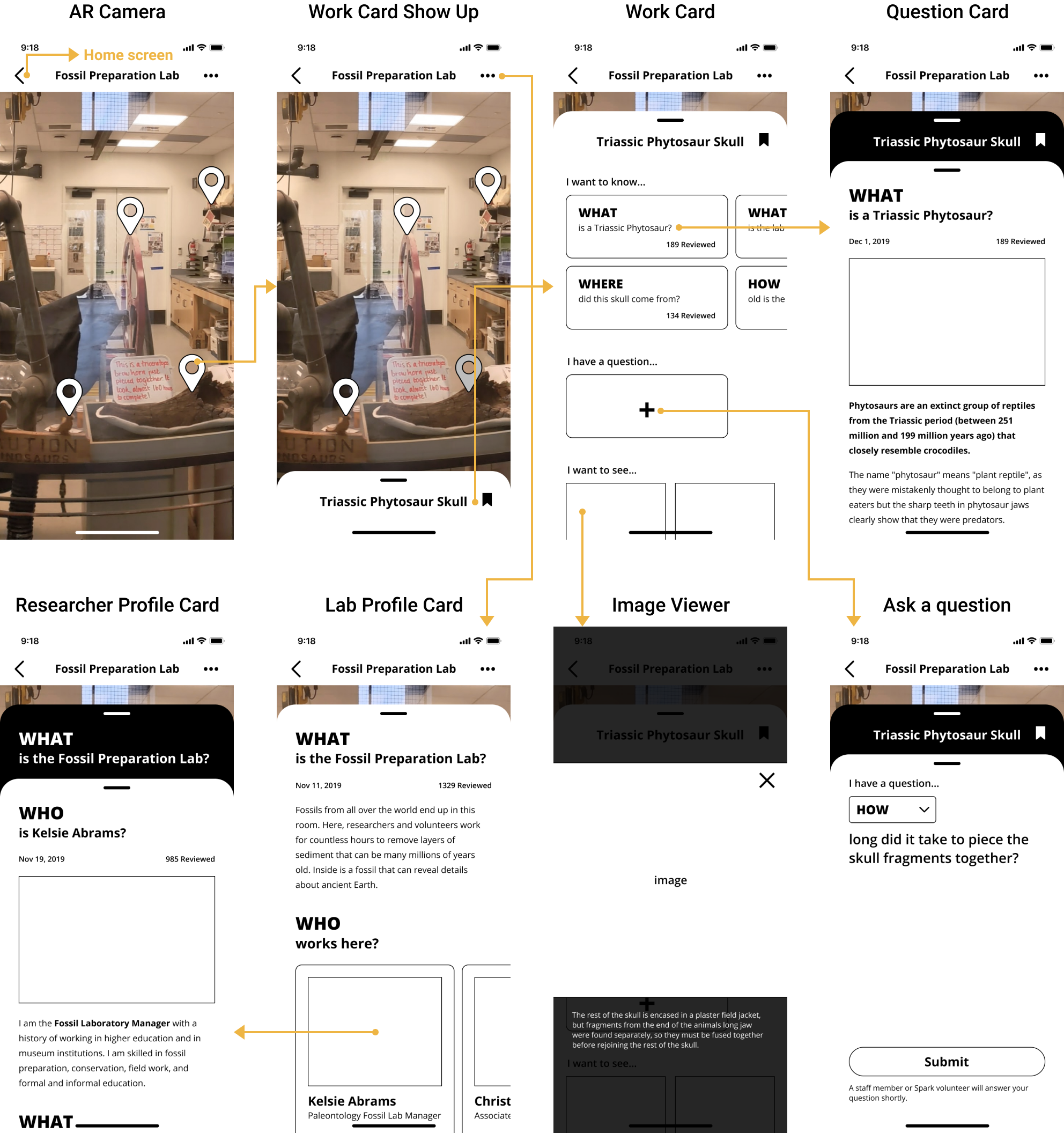
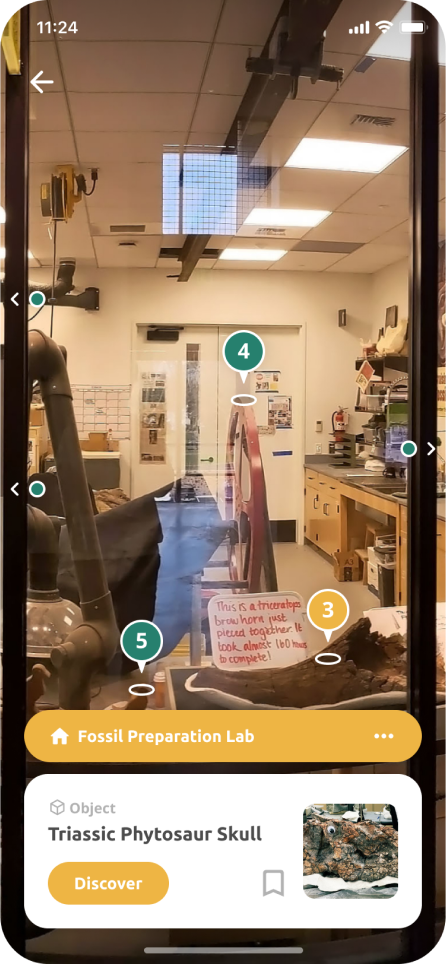
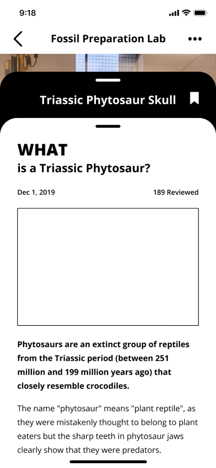
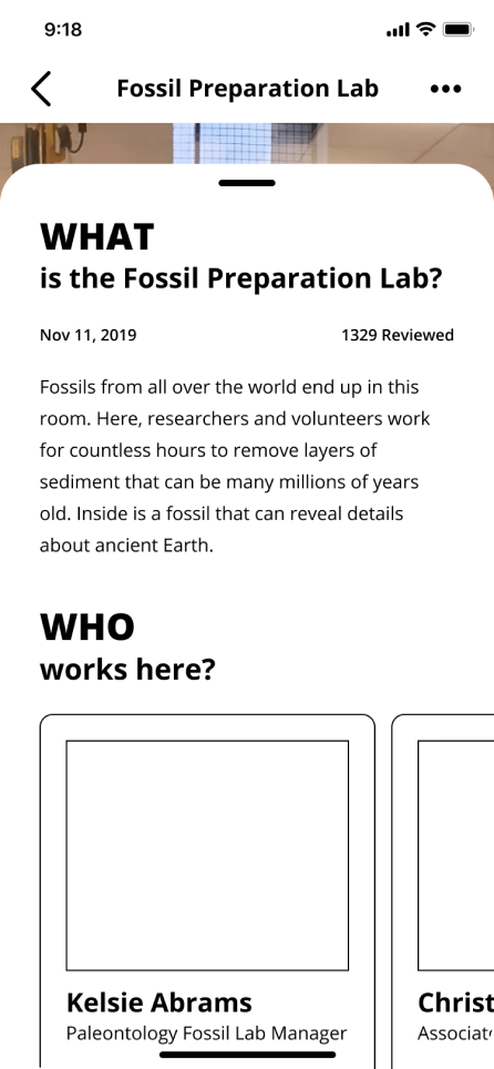
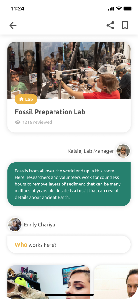
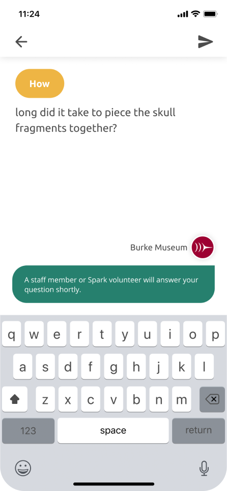
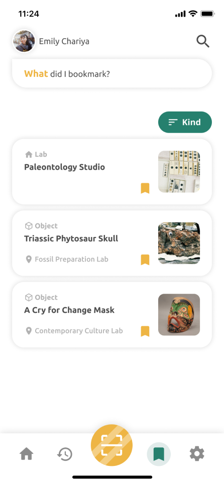
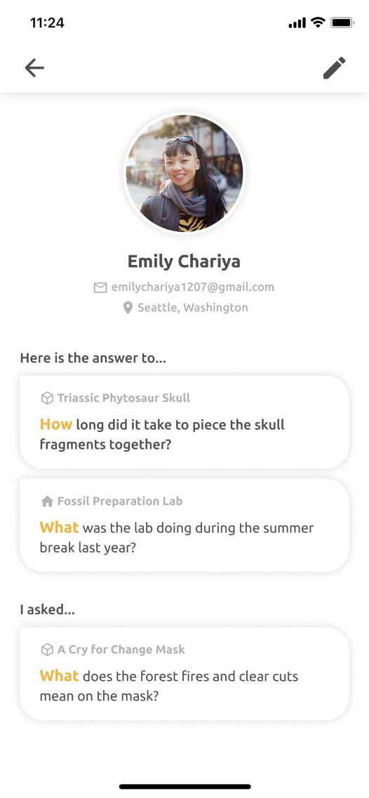
Tap a marker to bring up the information card of the 2D or 3D artifact, fossil, or equipment.
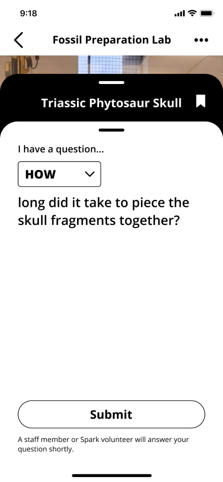
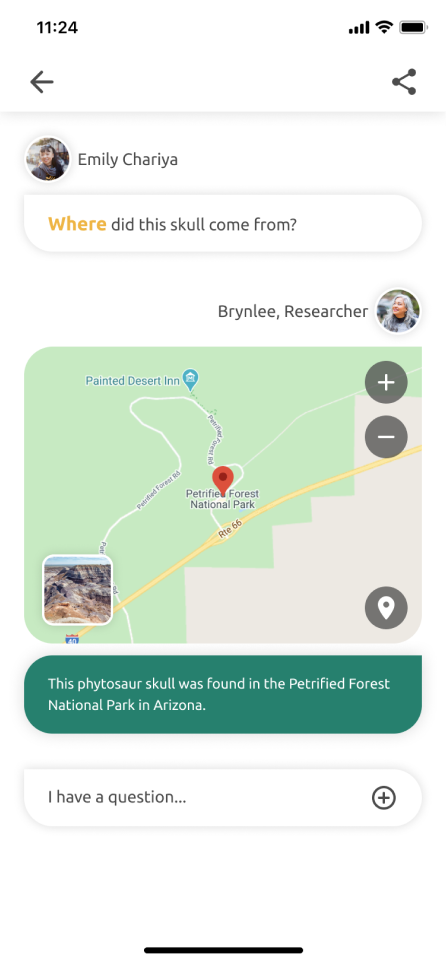
Select a question you want to ask about the objects on the information card.
When a question is selected, a conversation will pop up with the answer populated by the volunteers and researchers.
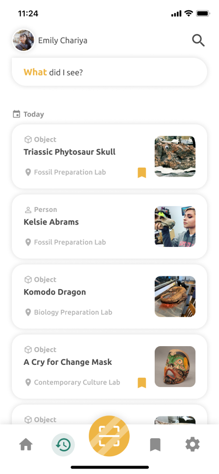
Check out the role and the ongoing work of the researchers you’ve chatted with.
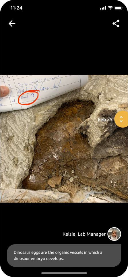
Scroll through the work on done on an object over the past few days.

The primary research started with an interview with Kate Fernandez, the Director of Visitor Experience at the Burke, and three museum visits to observe and speak to the researchers, volunteers, and visitors.
“Our goal is to compel all visitors to believe and takeaway that the new burke is alive.”
— Kate Fernandez

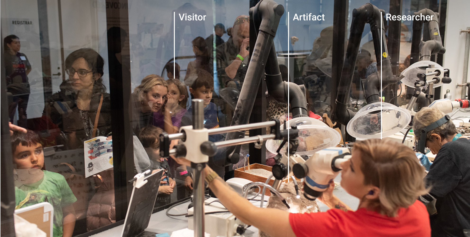
The labs and workrooms change over time and the museum wanted to keep visitors coming back to learn by observing workroom activities.
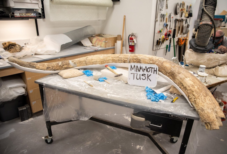
The researchers use whiteboards around the labs to show the relevant information about their works.

Through the research, we realized that without human interaction, the whiteboards are unable to really show a comprehensive progression of the artifacts.

The Burke engages with the visitors using an inquiry-based learning approach, encouraging them to ask questions about what they are curious about rather than directly presenting the information.
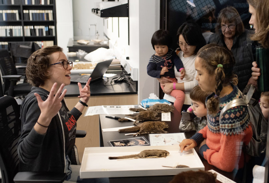
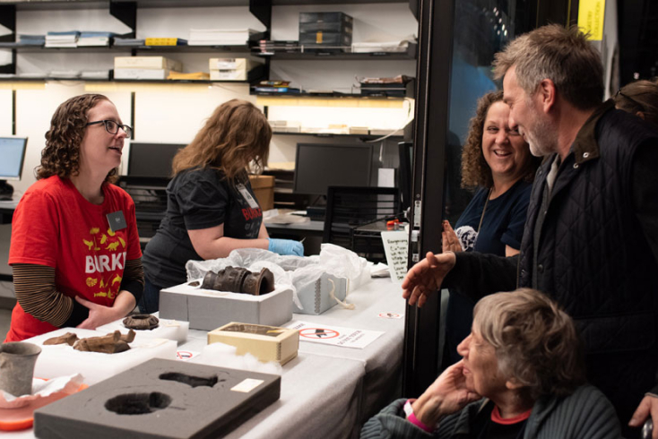
The volunteers connect with researchers and facilitate conversations with visitors. They answer visitors' questions and build on common questions to share with visitors.
The open door events on weekends allow visitors to directly interact with the researchers and get a closer look at the museum collections.

Weekday visitors do not have the opportunity to interact with researchers and volunteers who bring the you closer to the real work.

Visitors are left to their own interpretation, no longer meeting the goal of "making learning accessible and understandable to the public.
We considered mobile phones shouldn’t replace visitors' entire experience. It should be a tool to mediate how we interact with the real world. Also, we were assigned to create a mobile app and explore how we could use mobile technology and interactions to create a new visiting experience.

We came up with 3 AR-related directions and down-selected to the AR maker.

Volunteers capture and input information they gather from the workrooms by planting AR markers and referencing past relevant field notes for more information.

Visitors get more information about the museum by browsing digital floor plans with location-triggered notifications and scanning fossils and artifacts in workrooms.

Visitors submit public questions attached to any objects or people in workrooms, which will be followed up by staff members or volunteers soon, using AR interface.
We chose to go ahead with the AR Marker idea but refocused on visitors' experience rather than volunteers’ to refined the concept.
We created digital prototype to simulate the interaction in Augmented Reality using gyroscope sensor. The goal of the prototype is both to validate the concept and observe how people explore museum space using our AR interface.

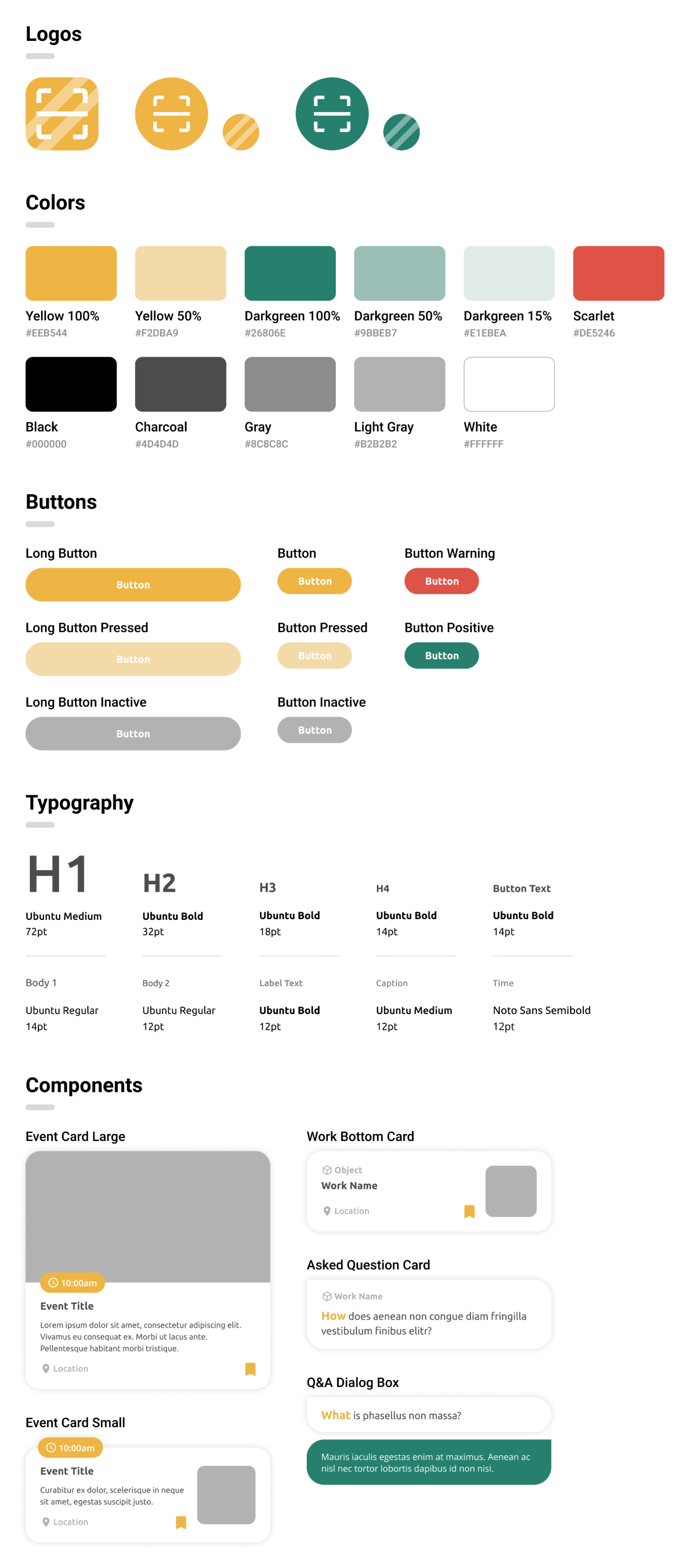
Inspired by Fluid Interfaces, we would like to put users in total control while using AR camera and browsing works profile. We chose to create a card stack interface to present different hierarchies of information, which also enable users to go back to any previous screens by using one gesture.
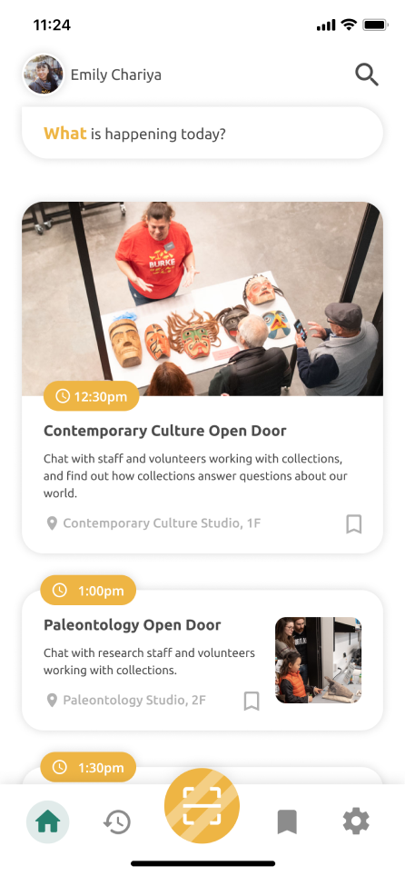
Here people can browse the information of upcoming events in different workrooms, making a better plan of their visit. The bold yellow button will lead them to the AR camera. Besides, people are also allowed to review the objects they have explored and follow up the questions they posted on the history and question page.
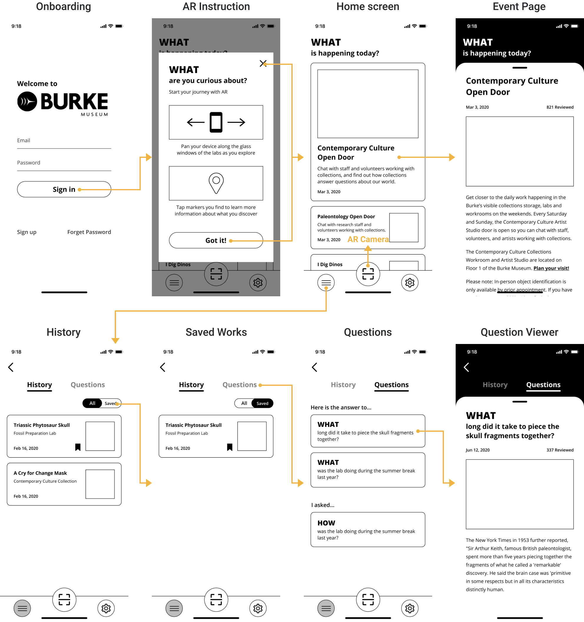
Once people launch the AR camera, they can uncover the profiles of labeled works in workrooms. The profiles are composed of the most common questions and photos left by volunteers and researchers. People can also ask questions about the works and check back to see the responses.
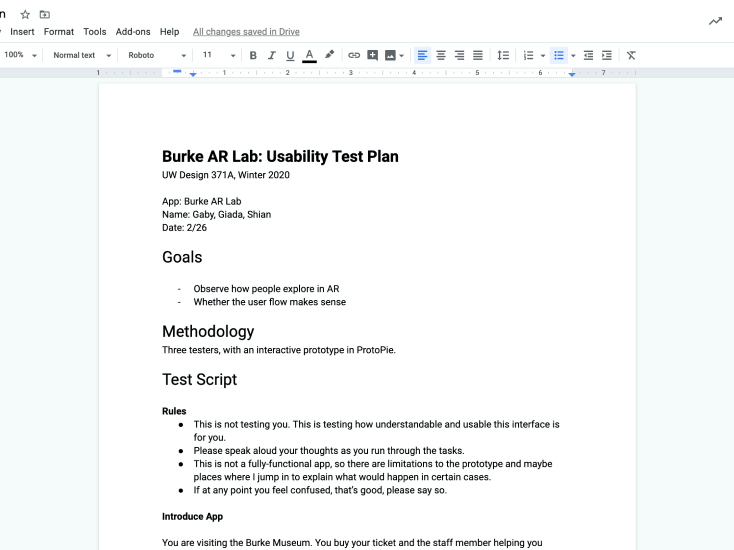
Usability testing protocol
Through the usability testing, we realized we had to reduce both the learning curve and the information architecture of the app, providing the right amount of information in each context with comprehensive instructions.


We redesigned the AR onboarding screen to guide users find out AR markers in any possible situations. Once the users point the camera to a workroom, the green dots will show up on the sides to indicate the nearby AR markers which are out of screen.


We abandoned card stack interface and chose to use the most common back button for navigation, smoothing the learning curve.
We decided to put most questions and answers into dialogue boxes, in which form the users are more comfortable and willing to read through just like reading messages from friends casually.


We redesigned the onboarding by adding instructional pages and simplifying the signup flow by requiring users to input minimized information to start their inquiry-based learning journey.
Meanwhile, we considered the touchpoints of our solution, mapping out the structure of the app to help ourselves to think through the user experience from a holistic point of view before diving into details.

Olivia is a high school student. She attended an archaeology course at school and is highly interested in what an archaeologist does every day.

Upon doing some research, Olivia visits the Burke in the afternoon over the weekend, when the museum has open door events where she can directly chat with the researchers working in the labs.


In front of the ticket booth, Olivia notices the information of Behind the Glass that helps her go deeply into the ongoing works in each lab through Augmented Reality. She downloads the app while waiting in line.
Olivia signs up with her Google account promptly and reviews today events in the museum on the main screen. Unfortunately, she misses all the open doors because she arrived at the museum too late.

Olivia disappointedly walks inside the museum. She sees the indicator signs on the glass that encourage her to scan the objects in the workrooms.
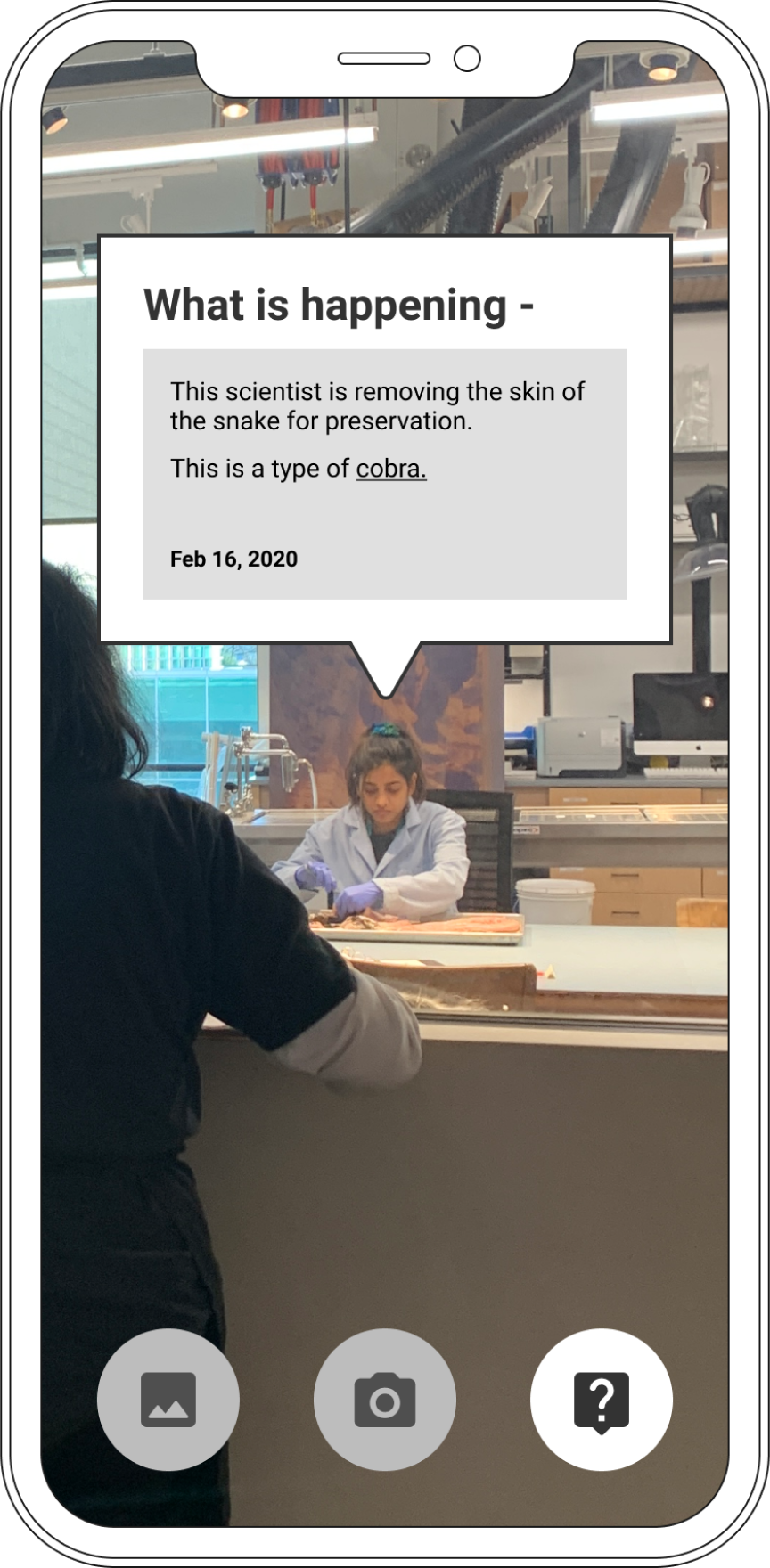
Olivia takes out her phone and follows the instructions to scan through the fossil preparation lab. Since the volunteers are talking with other visitors, she decides to explore the triassic phytosaur skull by herself.
Olivia reads one of the questions on the work page about where the skull came from. A researcher in the workroom has answered this question by sharing the map location following by a short description in dialogue format.

After browsing the common questions, Olivia comes up with her own once to the workroom. She writes down her question briefly and sends it out to the museum with one click.

Olivia also reviews a photo of dinosaur eggs. She finds the scroll bar on the side that enables her to easily trace back the progression of the work by showing the everyday photos of the eggs.


Olivia retrospects her journey and shares the works she saw with other her family at home.
Olivia reviews the fossils, workrooms, and people she explored in the museum on history page and saves the ones she really likes.
We separated history and bookmarks into individual pages in the final prototype to simplify information hierarchy.
The next day, Olivia receives a notification that her question has been answered by a researcher in the workroom.
In the final prototype, we integrated the question page into user’s profile page, where users can review the their questions by tapping their thumbnails.